
Client context
Anyone looking for a mental coach is looking for trust.
Mental coaching isn't a product, it's a longer collaboration with one person. The visitor is judging whether they want to work with this practitioner — not which package is cheaper.
That's why the site speaks in the first person singular, and why there is no service list on the opening screen. There is one decision on it: start the conversation.
Scope delivered
What the finished site contains
Everything below can be checked on the published site.
- A single promise on the opening screen
- “Ahol a gondolkodásból teljesítmény születik” (where thinking becomes performance) — the headline does not name the service but the result the client comes for.
- Personal phrasing
- The subheading speaks in the first person singular: "with my help". In a one-person practice, the corporate "we" isn't credible.
- A single button
- "Let's begin" — not a quote, not a download. The next step is a conversation.
- Imagery placed in the sporting world
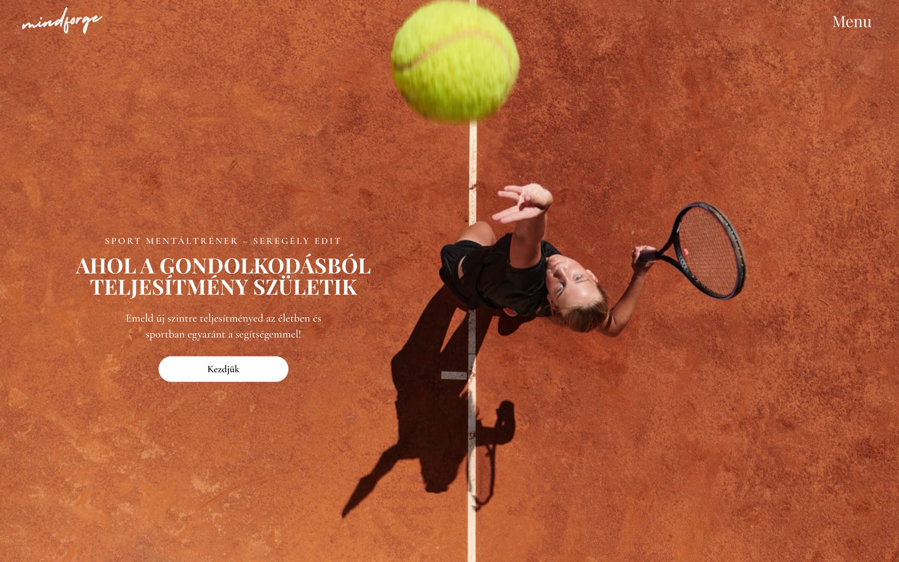
- An overhead view of a clay court mid-serve. The audience recognises itself immediately.
- Responsive layout
- A layout that works on phone, tablet and desktop alike.
Design direction
One colour, one photograph, nothing spare
The terracotta of the clay supplies the whole page's palette, so no added brand colour is needed. It also means that changing the photograph changes the mood of the page — a deliberate choice for a brand whose image library will grow over time.
The headline is a narrow uppercase serif, the body text the same family at a smaller size. One typeface instead of two, with two levels of hierarchy.
The photography and the brand mark came from the client.
What isn't here yet
There are deliberately no result figures
We publish no client counts, enquiry counts or revenue effect. In a coaching practice those also touch client data, so they could only be published with explicit permission.
Where to next
If you have a similar job, these are the next steps.