
Client context
Visitors didn't come to read, they came to book.
For a local service, most visitors have already decided: they arrive from search or social media and want to get one thing done. If booking isn't on the first screen, the visitor calls — or doesn't.
The second question they ask is whether the place is any good. The website's own copy doesn't answer that — other people's opinions do.
Scope delivered
What the finished site contains
Everything below can be checked on the published site.
- Booking as the main button
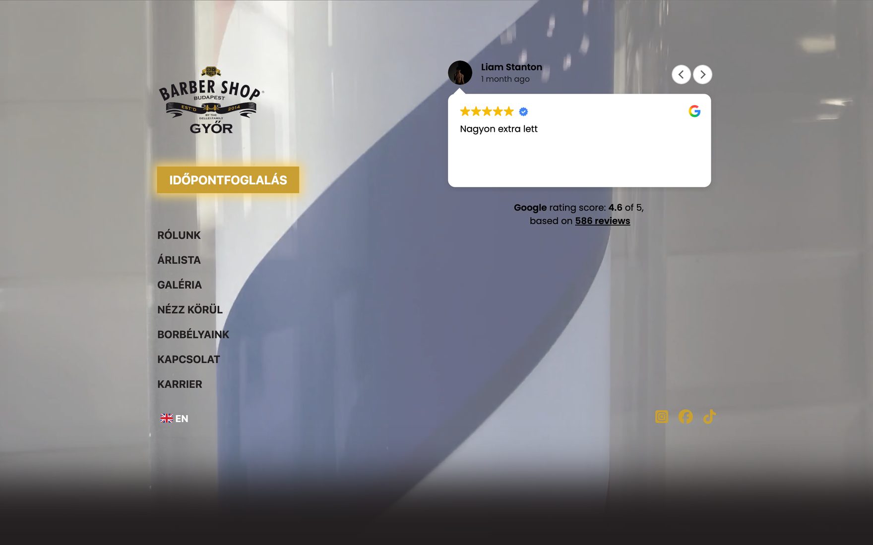
- "Book an appointment" sits as a gold button in the middle of the opening screen, above the menu. It is the only element on the page marked with an accent colour.
- Google reviews on the opening screen
- Real, checkable customer reviews where the decision is made — not on a separate page nobody opens.
- The full menu structure
- About, Price list, Gallery, Look around, Our barbers, Contact, Careers. The careers page is in the main menu too: finding skilled staff is a real business task in this sector.
- Bilingual interface
- A Hungarian and English language switch below the menu.
- Responsive layout
- A layout that works on phone, tablet and desktop alike — in this sector most traffic arrives from a phone.
Design direction
A monochrome background and a single gold accent
The background photograph is deliberately restrained, close to greyscale. In that visual world there is exactly one saturated colour, and it is the booking button. When a page highlights one colour, nobody has to be told where to click.
The logo carries on classic barbershop iconography; the menu below it is uppercase and widely tracked — the same formal language that appears in the shop itself.
The brand mark and the photography came from the client.
What isn't here yet
There are deliberately no result figures
We publish no booking counts, traffic data or revenue effect, because that data lives in the client's booking system, not with us. And we don't write down estimates.
Where to next
If you have a similar job, these are the next steps.